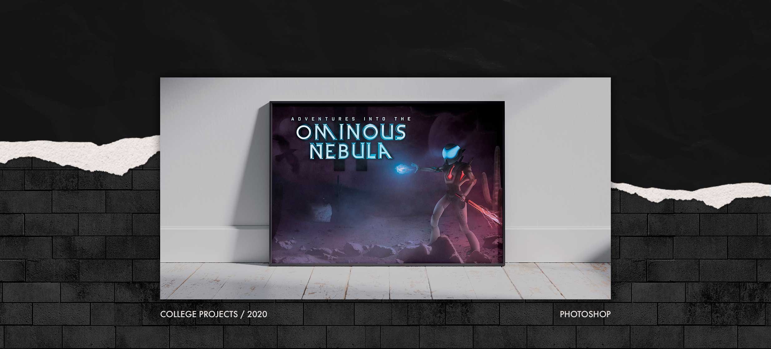


Adventures Into The Ominous Nebula
The concept behind this design was creating a character of my own imagination and bringing it to reality. It is something I have always wanted to do and knew it would push my boundaries. Overall, the creation would be an advertisement for an upcoming video game. The videogame is called, Adventures Into The Ominous Nebula. My main focus was on making the character look realistic even though they just started as pen tooled shapes. First I would add a texture, then add shadow and highlighting to each shape. Lastly, I would warp the textures so they would mimic the orientation of each body part. After I finished creating the main character I wanted to focus on bringing him into a neon light-based environment. There were many ways that I had imagined doing this but a desolate wasteland with neon light sources is where my inspiration drew me. He is kitted with a red lightning sword able to fend off and stun any enemies that stand in his way. He was gifted with a spirit that guides him to important locations and he goes on his journey. These were the two main light sources that would give up intense red and blue light. The rocks on the floor were highlighted and shadowed to match the environment as well. This project is the most challenging I have ever done I learned so many different things throughout the process. What I have provided is more than the image I originally had in my head. Overall, everything is supposed to give the vibe of mystery, thriller, and suspense leaving the question, “what’s next for our unknown hero?”


READY TO DIE ALBUM COVER REDESIGN
I was inspired to recreate this design because I have a love for HipHop music. It’s something that I listen to daily and it plays a big part in my life. This cover was meant to show the journey of my football career. All starting with a dream I first had when touching a football as a young kid, to playing here at Stony Brook University. I enjoyed the process of making this as many elements I found to be challenging. For instance, attempting to restore the old photographs proved to be hard, but I was able to make them all look similar. A huge part of this was finding the correct ‘hue/saturation’ I wanted to use. I also spent the majority of my time working on adding highlights and shadows to the correct portions of the images blending them into the background. This allowed me to achieve the same effect the baby that was featured on Biggie’s album had. Also, I had to do technical work by blending the image of me kneeling, to the football field background. This was done with some compositing and overall, I am most proud of that portion of the cover. All that was now left was adding in the need text and matching all the colors on both the front and back together. All in all, I was able to practice many techniques I wanted to have improved vastly upon them. This project challenged me but was very fun at the same time.